
A Process behaviour chart is a tool used within quality control and process improvement to assess and describe a process’s variability over time.
Through capturing (and interpreting) variability in process output, an organization can gain an understanding of causes such as random acts vs predictable patterns. The insight gained can be used in activities such as continuous improvement.
In today’s article, we’ll be looking at the process behaviour chart; we’ll be covering:
- What is a process behaviour chart?
- What are the types of process behaviour?
- Why use a process behaviour chart
- Where are process behaviour charts used?
- How to create a process behaviour chart
- Example process behaviour chart
- Benefits of using a process behaviour chart
- Issues with process behaviour charts
What is a process behaviour chart?
Quality and variability are inextricably linked; as variability increases, quality decreases and vice versa. As a result, organizations will look to both understand processes and reduce variability.
They are likely to use tools and methodologies to accomplish this task.
A process behaviour chart is such a tool used to portray variations in a process over a defined time period.
Using the chart, we can analyze process output, look for signals that result from particular causes, and then take appropriate steps to improve.
Process behaviour charts have several characteristics:
- They rely on data being collected pertaining to a process
- They are based on statistical principles,
- The chart includes:
- Process/control upper and lower limits
- Average performance
- Data points over a defined time period
- Identifies the stability within the process by depicting how data points fluctuate in value over time.
- Support data-driven decisions
- Are widely used across a range of industries
- Are relatively simple to use, and as a result, a wide percentage of the organization can be trained in thier use
- It can be used to identify if improvement actions were successful
- Is an effective communication tool when describing process performance.
Once in place, organizations can, over time, use the tool to monitor processes and identify trends in performance, with the target being to help inform an organization and help distinguish between causes of variation.
What are the types of process behaviour?
Process behaviour is tightly defined in one of two ways
- Common Cause Variation:
- Normal/Expected behaviour of the process
- Variation as a result of natural causes, i.e. machine wear and tear,
- Special Cause Variation:
- Occurs due to abnormal changes in the process
- increase of variability
- Indicative of a problem with the process.
Why use a process behaviour chart
Businesses have key expectations pertaining to processes; they generally expect that:
- Processes are effective,
- Produce an output that meets customer requirements
- Have minimal waste and inefficiency
Many tools are available to help organizations assess processes and performance, from tools such as lean and six sigma, which all help an organization on its journey of continuous improvement.
For those in leadership roles who have responsibility for selecting organizational tools, there is a real reason why tool selection matters. There is a requirement for:
- Effectiveness (both time/cost)
- Consistent, high-quality results
- Simplicity so that the tool’s use can be scaled up within the organization and utilized as a part of a standard toolset
- Training requirements are low.
Process behaviour charts meet many of these requirements, they:
- Have a simple premise – i.e. provide a visual representation of data over time
- Offer a simple method of using data and statistics to gain insight into a process
- Require only a basic understanding of various moving parts within a process:
- Output, time, control limits
- Help in the development of a working hypothesis of process behaviour.
- They are effective in monitoring a broad spectrum of data types.
Where are process behaviour charts used?
While often associated with manufacturing, as we described earlier, process behaviour charts are used in a variety of industries and situations where data can be captured and assessed; these include:
- Manufacturing – where such tools are often used for monitoring production processes.
- Healthcare – for monitoring process effectiveness, quality of care and outcomes.
- Service industries – for monitoring process outcome/delivery (i.e. call handling time), customer satisfaction
- Functions – such as Supply Chain, where the tool can be used for monitoring the performance of internal processes (such as SIOP) and supplier side, such as delivery performance and quality.
How to create a process behaviour chart
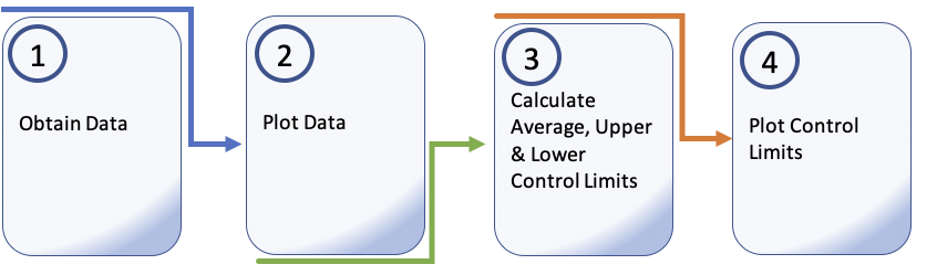
Creating a process behaviour chart requires a series of steps:
- Obtain data pertaining to the process – this assumes that you gather sufficient data that is representative of the process (this requires some thought beforehand!).
- Plot the data
- Calculate the Average, Upper & Lower control limits:
- Calculate the average of the data points you are using.
- Calculate the standard deviation of the data points.
- Calculate the upper control limit by:
- Average + 3 * standard deviation
- Calculate the lower control limit by:
- average – 3 * standard deviation
- Plot the control Limits.
We can then use the results to assess the process and identify patterns.
Key to this understanding is how data relates to the control limits we have established.
Where we map data points that frequently appear outside control limits, we may assume that the process is unstable and requires further attention and/or analysis.
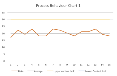
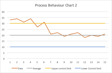
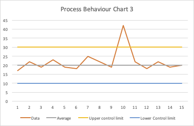
Example process behaviour charts
The four examples below indicate how the process behaviour chart might portray processes demonstrating different states.
1/ An in-control Process
2/ An improving position
3/ A process indicating a one-off event
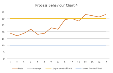
4/ A worsening position
Process behaviour charts are interpreted by looking for signals represented by data point(s) on our chart; such signals are unlikely to be random and will usually require further assessment to determine the cause.
As we can see in example 2, a one-off event has occurred. The chart clearly represents a change that has occurred, but it is short-term.
Chart 4 represents, through a cluster of data points and an identifiable trend, a position that is deviating from being in control over time.
As you can see from the examples shown, subject to the performance of the process, we can expect differing results from our charts. While the underlying cause may require further investigation, the charts provide a relatively simple way of demonstrating events and provides useful insight to those reviewing activities.
Benefits of using a process behaviour chart
Common benefits of using a process behaviour chart include:
- They enable data-driven decision-making.
- They are simple to use; they require simple inputs and only a basic understanding of statistics.
- They can be used in a wide variety of industries
- They can be used to monitor a wide range of data types,
- Users only require simple levels of training in order to obtain benefits.
- They can drive measurable improvement in processes
- Where used routinely, they can help with the early detection of potential process issues.
- They can help with forecasting, decision making and problem-solving.
Issues with process behaviour charts
Common challenges of using a process behaviour chart include:
- There is a key dependency on reliable data.
- If data is limited, the user may face challenges in calculating reliable control limits.
- A level of process knowledge is still required.
- Aligning out-of-control data to events still requires work and interpretation that can be incorrect.
- In highly complex situations, understanding variability can remain challenging.
- Process behaviour charts are a tool for understanding events and may not address resistance to change from operators of the process.
Summary
Businesses need methods of determining if their processes are effective.
The application of process behaviour charts is widespread and has been adopted in order for organizations to assess process variability with a view to understanding events and driving improvement.
Process behaviour charts are a simple tool used within a wide range of industries for gaining insight into processes. They are a simple but effective way of using data to drive decision-making and improvement.
Their key objective is to assess a process to measure stability and highlight events or trends where undesirable process behaviour occurs.
However, despite their “relative” simplicity, many businesses still find their use challenging as a result of small sample sizes, incorrect interpretation of results or resistance to change.
Despite these challenges, continuous improvement cannot happen without understanding and, to a large extent, relies heavily on monitoring and control of the process and, as such, a toolset that can facilitate it.