The seven basic tools of quality, which are often associated with Dr Kaoru Ishikawa, are a set of quality control tools that can be used for problem-solving and continuous improvement.
In this article, we’ll be looking at the seven basic tools of quality; we’ll be covering:
- What are the seven basic tools of quality
- The seven tools
- Cause-and-effect diagram
- Check sheet
- Control chart
- Histogram
- Pareto chart
- Scatter diagram
- Stratification
- Benefits of the seven basic tools of Quality
What are the seven basic tools of quality?
In 1968 Dr Kaoru Ishikawa published his book “Gemba no QC Shuho”, which focused on appropriate techniques to manage quality in organizations.
These techniques often referred to as the seven basic tools of quality, are a set of methods that can be used to resolve the most quality-related issues and situations.
They are used for several key reasons
1/ They are relatively simple to use and require only a modicum of training
2/ They don’t usually require any special tools or software other than a spreadsheet package.
While the tools can sometimes vary (you might see “the original tools” and “modern tools”), they tend to be variations of a theme.
The seven usually consist of:
- Cause-and-effect diagram
- Check sheet
- Control chart
- Histogram
- Pareto chart
- Scatter diagram
- Stratification
Let’s now review them in a little more detail.
1/ Cause-and-effect diagram
What is it? – It’s a diagram that can be used to show the cause(s) of an event or problem. It’s sometimes referred to as a fishbone diagram.
Example Cause and effect diagram
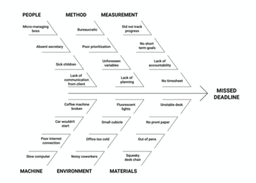
What’s it used for? – It’s often used to brainstorm and can be used to identify the causes and effects of a problem or situation.
How do you create a Cause and Effect Diagram?
- Can be created as a team or by an individual
- You can use a pen and paper (or software).
- Capture the issue you’re reviewing.
- Capture groups of causes (These can often be distilled into People, Environment, Equipment, Methods, Materials, and Machinery)
- Capture potential causes under each category
2/ Check sheet
What is it? – A form that enables you to capture data about a subject
Example Check Sheet?
Check sheets can come in all shapes and sizes – here is a simple example:
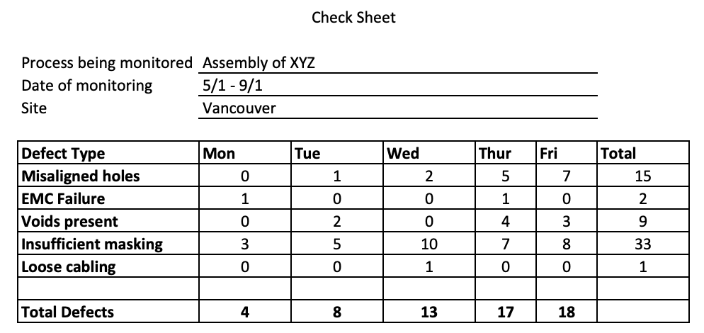
What’s it used for? Capturing and analyzing data
How do you create A Check Sheet?
- Decide what process or event you’re going to track
- Decide what data you will capture (this is normally time-bound, i.e. “I will capture the production quantity for the next three days”)
- Create a simple form that can be used for data capture
- Run a trial in capturing data to ensure it’s suitable (modify the form if not)
- Use the form to capture data in a live situation.
3/ Control chart
What is it? It’s a chart that shows how a process changes over time
Example Control Chart?
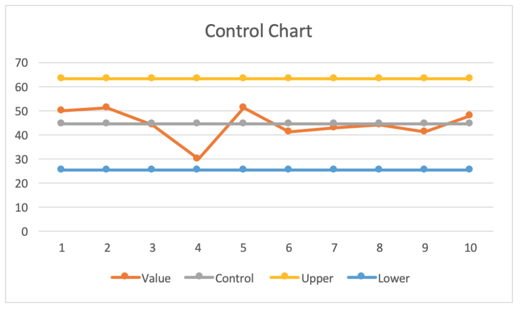
What’s it used for? It’s used to display data points along a time-based axis to demonstrate the variation of a process over time. For example, you might want to validate if a process is stable or determine levels of variation. You can also use the process to predict outcomes (based on trend)
How do you create a Control Chart?
- Choose the appropriate method of displaying data, i.e. time period, “out of bounds areas.”
- Capture data and plot of the graph
- Analyze
4/ Histogram
What is it? A histogram is a type of graph (a bar graph) that arranges data into groups or ranges.
Example Histogram?
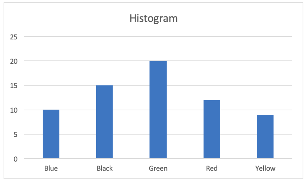
What’s it used for? Histograms are used to help summarise large sets of data (e.g. populations). They can be used to describe key features of a data set and its distribution, making it easier to understand for the reader. It can help highlight both gaps in the data and trends.
How do you create a Histogram?
- Capture data
- Define your groups (i.e., if you’re analyzing age ranges, you might define one group as 18-25-year-olds)
- Place “groups” on the vertical axis
- Place your summarised values for your groups on the horizontal axis
5/ Pareto chart
What is it? – A bar graph where data is grouped and the “bars” are arranged left to right in order of size (shortest to the right)
Example?
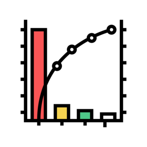
What’s it used for? By displaying the data in both “groups” and also in order of significance, Pareto charts are excellent tools for helping with problem-solving and root cause analysis.
How do you create it?
- Capture data
- Group data
- Graph data displaying the highest groups to the right
- Add a “cumulative line” which demonstrates how the “groups” total to 100% of the value.
6/ Scatter diagram
What is it? – It’s a graph that uses multiple axes to describe the relationship between two variables. Where data is related, this will be displayed on the graph by data correlating along a line or curve.
Example Scatter diagram?
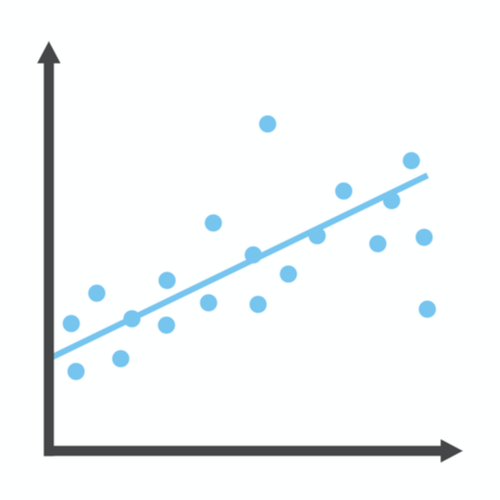
What’s it used for? Scatter diagrams are used in problem-solving when trying to understand if two data sets are related (or what the strength of that relationship is). They are often used during later stages of problem-solving once data has been collected and some hypotheses formed that require validation.
How do you create a Scatter diagram?
- Collect data
- Graph data using multiple axis to display data points
- Analyze patterns to discern the level of relationship between data types (note this may be merely visual where the relationship is obvious or may require regression or correlation analysis where it isn’t).
7/ Stratification
What is it? – Sorting data and analyzing as groups to aid understanding
Example Stratification?
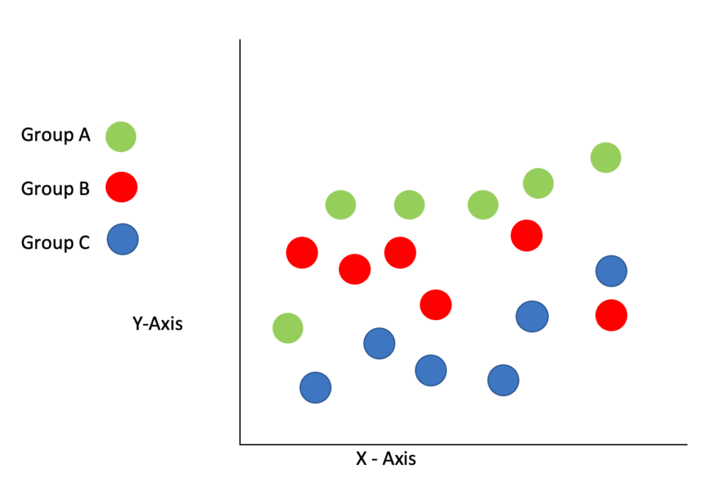
What’s it used for? It’s usually used during the early stages of problem-solving where data may be difficult to understand, and the collation of data may be beneficial and aid understanding and analysis.
How do you create it?
- Stratification happens early on in problem-solving, and the team usually determines how data will be grouped to determine relationships between cause and effect. These groups are then given to those gathering data so those aspects can be captured. Examples include Age Ranges, Regions, Material types, equipment used, time periods (e.g. days, weeks), customers, and products.
- Data is captured
- Data is analyzed
Benefits of Seven basic tools of Quality
So now we’ve explained what the tools are, let’s examine why these are the goto tools for helping to solve problems in your business; if we were to single out the key benefits, we’d suggest as follows:
- Each tool is quick and easy to learn.
- You can easily train people outside the quality department in their use, so they represent an ideal method of upskilling problem-solving in an organization.
- The tools offer a breadth of resources that can be used in different scenarios.
- Other than some basic tools (like a spreadsheet program), the tools are either free to use or low cost.
- They don’t require investment in expensive software or equipment.
- Aside from the data collection, each tool can be produced rapidly.
Summary
Applying these seven basic quality tools in your organization in order to support problem-solving can drive numerous benefits with perhaps the main one being that processes can be assessed and improved in a way that is simple and low cost to execute.
As the seven tools offer a breadth of the toolset, they can be applied to most situations.
Have you used any of the tools that we’ve described? What has been your experience? Any tips you’d like to share?
As ever, we’d love to hear from you; you can reach us on Twitter or via the comments section below.